


-
 +20 +3
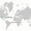
A Real-Time Map of Births and Deaths
In 1950, there were 2.5 billion humans. Today there are just over 7 billion. In another 30 years, according to U.S. Census Bureau projections, there will be more than 9 billion. Brad Lyon has a doctoral degree in mathematics and does software development. He wanted to make those numbers visual.
-
 +11 +1
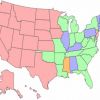
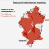
Here Are The States That Are Still Addicted To Smoking
If you or someone you love smokes, there's no better time than the present to quit -- especially considering November is Lung Cancer Awareness Month and Nov. 21 is the Great American Smokeout. But who's still smoking, anyway?
-
 +8 +2
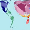
+8 +22013 World Population Data Sheet Interactive World Map
The 2013 World Population Data Sheet lists all geopolitical entities with populations of 150,000 or more and all members of the UN.
-
 +29 +6
I Noticed This Tiny Thing On Google Maps. When I Zoomed In... Well, Nothing Could Prepare Me.
A friend told me to go to a certain latitude and longitude on Google Maps. When I noticed it seemed to be in the middle of an African desert, I thought he was just sending nonsense. But when I zoomed in, my mind was blown. I noticed a tiny icon that looked like an airplane. So I did some more research and discovered there’s an incredibly tragic and beautiful story behind it. Here it is, from start to finish.
-
 +10 +4
Create Your Visited States Map
Create a color-coded Visited States Map, showing off your road travel in the United States.
-
 +13 +2
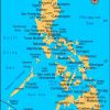
Mapping damage in Philippines
Volunteers have tagged thousands of social media images to online maps and rated typhoon damage to assist aid efforts.
-
 +8 +2
+8 +2Forest change mapped by Google Earth
A new high-resolution global map of forest loss and gain has been created with the help of Google Earth. The interactive online tool is publicly available and zooms in to a remarkably high level of local detail - a resolution of 30m.
-
 +10 +1
Time Lapse Nuclear Testing.wmv-Explosions from 1945 to 1998.
Japanese artist Isao Hashimoto has created a beautiful, undeniably scary time-lapse map of the 2053 nuclear explosions which have taken place between 1945 and 1998. It starts really slow — if you want to see real action, skip ahead to 1962 or so — but the buildup becomes overwhelming.
-
 +14 +3
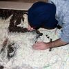
Dad says Google Maps shows dead son's body
Google says it will replace a Google Maps image after a California father complained it shows the body of his teen-age son, who was shot to death in 2009. Jose Barrera, of Richmond, California, said he discovered the image, visible on Google Maps' satellite view feature, last week.
-
 +11 +2
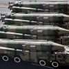
Satellite imagery reveals mystery 'supergun' in Chinese desert
Satellite imagery has revealed two unusually large artillery pieces, measuring about 80 ft and 110 ft respectively, at a test centre for armour and artillery northwest of Baotou in China.
-
 +8 +2
+8 +2Google Adds Airports, Train Stations to Street View
Travelers can plan their exaTraveling is stressful enough without having to worry about what the weather holds, or how to navigate an unfamiliar airport. But Google is looking to give anxious travelers some peace of mind before they embark on their trip by adding airports and train stations to Street View.ct route in an airport with Google Maps.
-
 +17 +3
How Google Earth is busting Persian Gulf nations for overfishing
Weapons-grade uranium isn’t the only thing Iran may be hiding. The country does not report its fishing catch to the United Nations, which is problematic given that the Persian Gulf, like other areas of the world, suffers from overfishing. But thanks to Google Earth, scientists now know that Iran hauls in more than 12,000 tonnes a year from 728 weirs, large structures built in intertidal zones to trap fish.
-
 +11 +4
Canada to file claim to expand its Arctic seafloor boundaries
Some time this week, Canada is expected to make its case to the world to dramatically expand its boundaries by an area equivalent to the size of all three Prairie provinces. Canada’s deadline is Friday to apply to a United Nations commission for exclusive rights to what is likely to be another 1.7 million square kilometres of Arctic seafloor.
-
 +23 +4
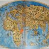
Italian Pietro Coppo's World Map from 1520
Notice how unknown the rest of the world was, especially the Americas.
9 comments by TNY -
 +14 +2
The 'Super Mario' NYC Subway Map
Perfect for the transit-obsessed gamer on your list: designer Robert Bacon's "New York City Super Mario World Map," which renders the city's subway system
-
 +11 +3
Human Portraits Hidden in the Topography of Maps
The Cardiff-based illustrator finds portraits of human faces hidden amongst the topographical features in various maps of the world.
-
 +15 +3
11 Overlay Maps That Will Change The Way You See The World
Nothing is what it seems.
-
 +9 +4
+9 +4Google’s Road Map to Global Domination
Google’s original map was rudimentary, essentially a digitized road atlas. Like the maps from Microsoft and Yahoo, it used licensed data, and areas outside the United States and Europe were represented as blue emptiness. Google’s innovation was the web interface: its map was dragable, zoomable, panable.
-
 +18 +3
Worldmapper: The world as you've never seen it before
Worldmapper is a huge collection of interesting cartograms - maps with countries resized according to different factors. Those who like visualizing data can waste a lot of time looking through this repository.
-
 +17 +3
The Literal Meaning Of Every State Name In The U.S. - Infographic
The New Navel of the Moon. It’s so poetic, isn’t it? (And sure, maybe a bit anatomically confusing.) That’s the real meaning behind the state name New Mexico, and it’s one of many etymological gems uncovered by cartographers Stephan Hormes and Silke Peust while they were creating this U.S. map depicting the original, literal meanings behind the states and cities we know today.
Submit a link
Start a discussion