


-
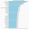 +2 +1
+2 +130 most edited regular Wikipedia pages
-
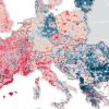 +10 +2
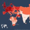
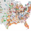
This Incredibly Detailed Map Shows How Europe's Population Changed From 2001 to 2011
Since the turn of the millennium, Europe has been undergoing some pretty intense demographic change. Just how intense—and intricate—this change has been is revealed in a new map created by Germany’s BBSR, the country’s Federal Institute for Research on Building, Urban Affairs and Spatial Development. The BBSR collected data between 2001 and 2011. While that might sound slightly outdated, these are actually the most up-to-date figures Europe has to offer...
-
 +12 +4
U.S. Slips In World Well-Being Rankings; Panama Is No. 1
As a region, the Americas fare quite well in Gallup's new global index of personal well-being, but the U.S. fell from No. 12 to No. 23 worldwide. The top 10 includes Costa Rica, Belize, and Mexico. Panama took the top spot for the second straight year in the Gallup-Healthways Country Well-Being report, with Costa Rica second. Switzerland was the top European country, in fourth. At No. 23, the U.S. is one spot behind Israel and one ahead of Canada.
-
 +16 +3
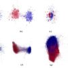
Metaphor map charts the images that structure our thinking
Huge project by Glasgow University researchers plots thirteen centuries of startling cognitive connections.
-
 +9 +1
+9 +1Bad Maps Are Everywhere These Days. Here's How to Avoid Being Fooled
Tips from a geographer who's seen it all.
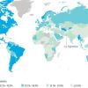
-
 +1 +1
+1 +1Visualizing survey results excellently - Junk Charts
Surveys generate a lot of data. And, if you have used a survey vendor, you know they generate a ton of charts.
-
 +1 +1
+1 +1My dataviz portfolio!
You could call it a hobby now, but in grad school I took a course on data visualization and I grew to love it. I draw my inspiration from Tufte, The Economist, and Wes Anderson (haha). I'm always happy to hear feedback on my designs, so let me have it! And, FYI, I'd be happy to do data viz work for you--for free, even, if it's for a good cause and you can offer some recognition.
-
 +2 +1
+2 +1Norse Attack Map
Every second, Norse collects and analyzes live threat intelligence from darknets in hundreds of locations in over 40 countries. The attacks shown are based on a small subset of live flows against the Norse honeypot infrastructure, representing actual worldwide cyber attacks by bad actors. At a glance, one can see which countries are aggressors or targets at the moment, using which type of attacks (services-ports).
-
 +11 +1
NSFW Pornhub Millennials Insight - User Data
The Millennial generation, members of which are also sometimes referred to as Echo Boomers, consists of the demographic cohort born roughly between the years 1982 and 2000. Through a special collaboration with our friends over at Mic.com, we’re taking a look at the particular way that Pornhub’s 18-34 users interact with the largest adult site in the world.
-
 +28 +5
Google Trends - "Snapzu"
-
 +19 +2
Where the Internet Lives: This Map Shows Which Countries Have Most People Online
What countries look like if they're sized proportionally to their number of internet users.
-
 +80 +1
The Bernie Sanders Surge Is About Bernie, Not Hillary
“The recent rise of Bernie Sanders,” wrote Vox’s Jonathan Allen last week, “points as much to [Hillary] Clinton’s vulnerability as Sanders’s strength.” Allen went on to argue that Joe Biden should …
-
 +15 +7
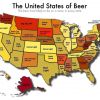
The United States of Beer
The American beer industry is alive and well. The number of breweries is increasing across the country, and with this has come incredible geographic variety in the beers people drink. Depending on where you are in the country, certain local and national beers are much more likely to be on the menu than others.
-
 +7 +1
+7 +1This Is What Music Would Look Like If We Could See It
Similar to the fingerprints of humans, every sound in the natural universe has a unique, vibrational 'signature'. The CymaScope is a device that detects these vibrations and embodies them in a digital representation, allowing us to actually see these audio fingerprints...
-
 +2 +1
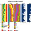
+2 +1Visualization of large datasets with tabplot
The tableplot is a powerful visualization method to explore and analyse large multivariate datasets. In this vignette, the implementation of tableplots in R is described, and illustrated with the diamonds dataset from the ggplot2 package.
-
 +19 +4
Graphing the distribution of English letters towards the beginning, middle or end of words
A very cool exercise, and I really like the author's handling of the semi-quantitative aspects of such an analysis.
-
 +18 +2
Mapping how the United States generates its electricity
Coal and natural gas are the most common sources for electricity in the country, but coal represents a declining share. The new Clean Power Plan seeks to accelerate that trend by requiring power plants to cut carbon pollution levels and rewarding states and companies that embrace clean sources of energy.
-
 +15 +3
This Is What Controversies Look Like in the Twittersphere
A new way of analyzing disagreement on social media reveals that arguments in the Twittersphere look like fireworks.
-
 +2 +2
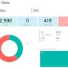
+2 +2PowerBI Fantasy Football Player Stats Dashboards
Every year at Pragmatic Works some coworkers, including consultants, marketing staff, support team members, software development staff and project management, partake in a company fantasy football ...
-
 +21 +7
A Stunning Visualization of Yellow Taxi Pickups in NYC (01/2015 - 06/2015)
A map of NYC, plotted using locations of all yellow taxi pickups from January 2015 to June 2015. Data visualization was created by Max Woolf. You can find more information / data about NYC's taxis, inside.
Submit a link
Start a discussion