-
 +33 +1
The Geeks Who Put a Stop to Pennsylvania's Partisan Gerrymandering
Pennsylvania's congressional map has long been aggressively gerrymandered, silencing Democratic voters. These are the experts who helped change that for good.
-
 +37 +1
Your Mobile Phone Can Give Away Your Location, Even if You Tell It Not To
US military officials were recently caught off guard by revelations that service members' digital fitness trackers were storing the locations of their workouts – including at or near military bases and clandestine sites around the world.
-
 +17 +1
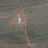
Strava has published details about secret military bases, and an Australian was the first to know
A fitness tracking app is revealing potentially sensitive military information thanks to its global heatmap.
-
 +25 +1
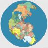
Pangea Supercontinent With Modern Countries Labeled
This is a map of the Pangea supercontinent created by digital artist Massimo Pietrobon with all the modern countries labeled.
-
+2
Interested in moderating this tribe?
no comments by kxh -
 +5 +1
+5 +1World health rankings.
The most comprehensive listing of country health profiles and world health rankings for all leading causes of death ever assembled in one place. (2014-WHO)
-
 +21 +1
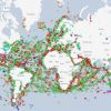
This revealing map shows the world's ships in real time
The ocean is a big place, which makes it a pretty difficult thing to wrap our brains around. It covers over 70% of the Earth’s surface, is home to millions of species of life, and it makes up 97% of all water on the planet. But, with this massive size and ubiquity also comes a significant challenge for humans interested in trade: it must be constantly traversed in order for us to move goods around.
-
 +12 +1
Four Centuries of Mapping the Subterranean World
Boston Public Library's Leventhal Map Center is exhibiting maps of volcanoes, catacombs, mines, subways, sewage systems, and other underground cartography.
-
 +11 +1
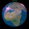
Flight Stream
Experiment to map many of the airline flights between world airports. It's <strong>not</strong> showing real time positions (which would be amazing but I don't have that data) but rather, great-circle routes between major airports based on flight data from the Open Flights
-
 +12 +1
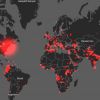
Startling maps show every terrorist attack worldwide over the last 20 years
Data from the Global Terrorism Database compiled into a stunning data visualization puts two decades of terrorist activity into startling perspective.
-
 +15 +1
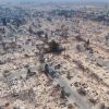
These 360° Drone Maps of California’s Wildfire Damage Are Horrifying
10,000 photos of a charred neighborhood, stitched together. By Samantha Cole.
-
 +26 +1
A Very Modern Map of Britain's Ancient Roman Roads
Let's take the VII from Londinium to Letocetum.
-
 +50 +1
America’s new tobacco crisis: The rich stopped smoking, the poor didn’t
The nation has largely won the war on smoking, unless you’re uneducated or live in a rural area.
-
 +8 +1
+8 +1The New York Public Library Has a “Digital Time-Travel Service” For Its Historical Maps
The New York Public Library's NYC Space/Time Directory is a "digital time-travel service" for their collections of maps and geospatial data.
-
 +5 +1
+5 +1The Underappreciated Man Behind the “Best Graphic Ever Produced”
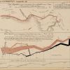
Charles Joseph Minard’s name is synonymous with an outstanding 1869 graphic depicting the horrific loss of life that Napoleon’s army suffered in 1812 and 1813, during its invasion of Russia and subsequent retreat. The graphic (below), which is often referred to simply as “Napoleon’s March” or “the Minard graphic,” rose to its prominent position in the pantheon of data visualizations largely thanks to praise from one of the field’s modern giants, Edward Tufte.
-
 +5 +1
+5 +1OECD Better Life Index
This Index allows you to compare well-being across countries, based on 11 topics the OECD has identified as essential, in the areas of material living conditions and quality of life. Compare it with 361 other OECD regions.
-
 +32 +1
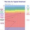
Your Life in Weeks
All the weeks in a human life shown on one chart. Sometimes life seems really short, and other times it seems impossibly long. But this chart helps to emphasize that it’s most certainly finite. Those are your weeks and they’re all you’ve got. Given that fact, the only appropriate word to describe your weeks is precious. There are trillions upon trillions of weeks in eternity, and those are your tiny handful. Going with the “precious” theme, let’s imagine that each of your weeks is a small gem, like a 2mm, .05 carat diamond.
-
 +5 +1
+5 +1CIA Releases Declassified Maps from 75 Years of Intelligence Cartography
To mark the 75th anniversary of its Cartography Center, the Central Intelligence Agency (CIA) shared decades of declassified maps.
-
 +3 +1
+3 +1How to Solve Genomics' Big Data Management Problem
Big data scientists can store human genomes for easy access. But what challenges do they face when it comes to storage and privacy?
-
 +6 +1
+6 +1OECD Health Statistics 2016.
OECD Health Statistics 2016 is the most comprehensive source of comparable statistics on health and health systems across OECD countries. All datasets have been updated in October 2016.
Submit a link
Start a discussion


