


-
 +16 +2
Infographic: Cool Things About The International Space Station
In recent years, there have been few space projects as exciting as the International Space Station, or ISS.
-
 +10 +4
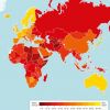
The 18 Most Corrupt Countries In The World
The most widely used indicator of corruption worldwide.
-
 +13 +3
Infographic: See Just How Popular The Most Popular Books Ever Written Are
Objectively popular literature, though, transcends a regional sample and becomes ubiquitous. (Think 50 Shades of Grey, for a recent example, or perhaps never think of 50 Shades of Grey ever again.) But the only way to gauge how popular such wildfire phenomenon books really are is to put them in a historical perspective, and crunch the numbers.
-
 +13 +4
Charts: Why fast-food workers are going on strike
This Thursday, fast-food workers in more than 100 cities are planning a one-day strike to demand a "livable" wage of $15 an hour. They have a point: The lowest-paid Americans are struggling to keep up with the cost of living—and they have seen none of the gains experienced by the country's top earners. While average incomes of the top 1 percent grew more than 270 percent since 1960, those of the bottom 90 percent grew 22 percent.
-
 +15 +2
11 Overlay Maps That Will Change The Way You See The World
Nothing is what it seems.
-
 +15 +5
How Colleges Fail Black Football Players
As the nation’s top college football teams prepare to take the field for the elite bowl games, three new reports out this week raise similarly troubling concerns about dismal graduation rates for many of the black players constituting the bulk of the starting lineups.
-
 +13 +3
Death penalty statistics, country by country
After the execution of Kim Jong-un's uncle, the brutality of North Korea's regime has once again come under the international spotlight. In a broader context, is the attention warranted? Find out who uses the death penalty today - and see how it compares to 2007
-
 +9 +2
+9 +2Home Improvements Under $1000 [INFOGRAPHIC]
Learn how you can do home improvements for under a thousand dollars with this awesome infographic from the Glass Tile Store.
-
 +17 +5
The Literal Meaning Of Every State Name In The U.S. - Infographic
The New Navel of the Moon. It’s so poetic, isn’t it? (And sure, maybe a bit anatomically confusing.) That’s the real meaning behind the state name New Mexico, and it’s one of many etymological gems uncovered by cartographers Stephan Hormes and Silke Peust while they were creating this U.S. map depicting the original, literal meanings behind the states and cities we know today.
-
 +17 +4
What Happens When You Tell a Lie?
If you've spoken to someone for more than 10 minutes today, odds are that one of you was lying. If that person was your mother, the odds of lying increase dramatically. From small fibs to huge, Hollywood-worthy tales of deception, lying is an enormous part of our lives. This infographic by Full Tilt Poker examines exactly how we lie — and how we feel about it afterward.
-
 +14 +2
What Is Going on In South Sudan?
The situation in South Sudan explained in simple point form and easy to understand format.
-
 +17 +5
How are you more likely die
This is an infographic about unlikely ways to die.
-
 +18 +8
Google dethrones Apple to become most talked-about company of 2013
Google had a pretty good year in 2013. The company’s share price exploded to all-time highs, Android now eclipses all other mobile platforms in global market share at more than 80%, and Google’s share of search traffic is still nearly 70% despite increased competition from Yahoo and Microsoft’s Bing. Now, there’s a new feather Google can put in its cap: According to Dow Jones, Google dethroned Apple in 2013 and because the most talked-about company in terms of global media attention.
-
 +14 +2
The Landline Is Dying And These Numbers Prove It
The nature of the telecommunications industry is obviously changing, and it's perhaps best illustrated with a look at these statistics that show the steep decline of the home landline. With a smartphone in your pocket that replaces a landline's capabilities and then some, it's no surprise to see that fewer and fewer people feel the need to hang on to an old-fashioned wire to ferry their communications back and forth.
-
 +21 +4
This Scary Map Shows Where Pregnant Women Smoke The Most
"Smoking by Pregnant Women May Result in Fetal Injury, Premature Birth, and Low Birth Weight," the Surgeon General has long warned. But while fewer pregnant women smoke now than a decade ago, a recent CDC report shows that 1 in 10 women still smoke while pregnant. The prevalence of this public health hazard varies widely across the country, from 2.3 percent of pregnant women in New York City to 30.5 percent in West Virginia.
-
 +11 +5
Unstoppable Luis Suárez
There’s simply no stopping Luis Suárez at present. The Uruguayan has netted 10 times in December thus far and has either scored or assisted 14 of Liverpool’s last 17 goals in the Premier League. The 26-year-old has picked up 4 successive WhoScored man of the match awards i...
-
 +15 +3
26 Things to Note Before Develop a Website [Infographic]
Before Develop a website there are some important fundamental questions you need to ask yourself first. This infographic from Pixaal...
-
 +13 +3
Best European football teams in 2013
This is good infographic of the best European football teams in 2013
-
 +2 +2
+2 +2Why is the Sky Blue? | Halftone
It's a simple question that few can answer correctly. A wonderful Interactive infographic about how the sky is blue. By Halftone
-
 +18 +5
The When and Why of the Breakup (or What Happens When Relationships Go South)
As the old song says “breaking up is hard to do”… but perhaps a little insight could help us understand why it happens in the first place. Information designers David McCandless and Lee Byron teamed up to create three graphics dedicated to breakup miscellaneum – from what day of the year is the most popular breakup day (the first Monday of December), to the country with the most affairs (we’re looking at you Turkey!).
Submit a link
Start a discussion