


-
 +11 +4
50 Mesmerising Designs That Make The Most Of Negative Space
Less is more? Arguably, you could both agree and disagree, depending on what the situation is pertaining to. If you’re talking about cheese on your pizza versus interest on your credit card, the answer is obvious (unless you’re lactose intolerant, which makes this case a lose lose).
-
 +20 +3
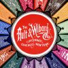
The Ault & Wiborg Poster Album
Ault and Wiborg's Art Nouveau lithographic poster ads. Color lithography was rapidly replacing letterpress in popular graphics and in a classic case of “at the right place at the right time” demand for Ault & Wiborg’s coal tar-based inks rose almost geometrically.
-
 +20 +5
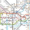
The London Underground map: The design that shaped a city
It looks like a cross between an electric circuit diagram and a Mondrian painting – but the London Underground map also revolutionised design. Jonathan Glancey travels back in time.
-
 +19 +3
The Font of Poetry, the Poetry of Font
I was a teenage font addict. On Microsoft Word I’d lovingly scroll through the drop-down font menu: Avenir Book, Baskerville, Goudy, Goudy Old Style. For every story or poem I started to write, I first spent hours choosing the font. The dystopian soap opera could only be in Geneva; surrealist time travel, Book Antiqua.
-
 +1 +1
+1 +1Aaron Draplin Takes On a Logo Design Challenge
An interesting look at the process of logo creation.
-
 +2 +1
+2 +1Aaron Draplin Takes On a Logo Design Challenge
-
 +17 +3
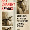
‘Art Chantry Speaks: A Heretic’s History of 20th Century Graphic Design’ by Art Chantry
Art Chantry is a con artist. The great con is the world of graphic design, and despite his protests to the contrary, Chantry is an artist. Like a magician revealing how his tricks are done, Chantry spills all in his new Feral House book Art Chantry Speaks: A Heretic’s History of 20th Century Graphic Design. Examples of his heresy to the trade abound, but I particularly enjoyed this quote, “Designers need to be aware out there. This stuff we do isn’t ‘art‘-it’s marketing language and propaganda."
-
 +16 +8
Troll for hire: the abusive art of Mr Bingo
Feeling a bit too good about yourself? For £50, art-punk provocateur Mr Bingo will send you hand-drawn hate mail and troll you endlessly on social media.
-
 +17 +3
Star Wars Travel Posters
Ever wondered what a poster for Pod Racing in Mos Eisley would look like? Or an aerial tour of Cloud City? Well wonder no more!
-
 +17 +3
London Illustration Fair 2015
Talented graphic designers and artists congregate to display their works. The graphic design and illustration scene in London is going from strength to strength at the moment, and part of the reason might be the British capital’s abundance of fairs where emerging talents can network and showcase their designs.
-
 +20 +4
Cover girl: the difficulty of illustrating Lolita persists, 60 years on
The discrepancy between cover designs for Lolita – published 60 years ago – and the themes of the novel are stark. But that hasn't stopped hundreds of designers trying to get it right.
-
 +31 +5
The manipulation of the American mind: Edward Bernays and the birth of public relations
“The most interesting man in the world.” “Reach out and touch someone.” “Finger-lickin’ good.” Such advertising slogans have become fixtures of American culture, and each year millions now tune into the Super Bowl as much for the ads as for the football.
-
 +17 +1
Facebook's New Logo Is A Visual Nod To Gender Equality
One of Facebook's iconic logos just got an update. That tiny image that lingers in the corner of most Facebook pages — two small silhouettes of a man and a woman — it will be a little different on Facebook mobile pages starting this week. The old image featured the woman's silhouette behind the man's, with the woman's figure a bit smaller.
-
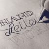 +17 +4
Quick Tip to Draw Straight Lines & Avoid Shaky Hand Lettering
Quick tips to avoid shaky hand lettering for both straight and curved lines with written instructions and animated gif illustration.
-
 +1 +1
+1 +1My dataviz portfolio!
You could call it a hobby now, but in grad school I took a course on data visualization and I grew to love it. I draw my inspiration from Tufte, The Economist, and Wes Anderson (haha). I'm always happy to hear feedback on my designs, so let me have it! And, FYI, I'd be happy to do data viz work for you--for free, even, if it's for a good cause and you can offer some recognition.
-
 +9 +1
+9 +1Clean Up Your Mess - A Guide to Visual Design for Everyone
If you're like most people, you feel like a baby when it comes to visual design. You sometimes have a vague sense of what you want, but can't articulate it or make it come about. All you can do is point and cry. This guide will help you communicate with conscious skill. It will show you how to create designs that are easy to understand and attractive.
-
 +2 +1
+2 +1New Logo for Oculus
-
 +19 +2
The Visual Tricks That Make a Poster Give You Pause
Some posters pause you mid-stride, others disappear into the background like so much white noise.
-
 +15 +1
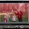
Hands-on: Adobe Photoshop Lightroom CC - moves faster, adds photo merge and face detection
Adobe Lightroom now uses your computer's GPU to run faster, adds facial recognition and photo merge features.
-
 +1 +1
+1 +1We look at nature with new eyes, and what it offers us to create
Submit a link
Start a discussion