


10 years ago
2
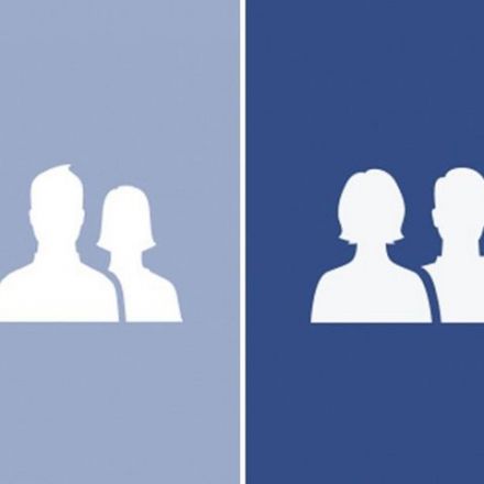
Facebook's New Logo Is A Visual Nod To Gender Equality
One of Facebook's iconic logos just got an update. That tiny image that lingers in the corner of most Facebook pages — two small silhouettes of a man and a woman — it will be a little different on Facebook mobile pages starting this week. The old image featured the woman's silhouette behind the man's, with the woman's figure a bit smaller.
Continue Reading http://www.npr.org


Join the Discussion
While on one hand I agree that the little symbols do add up, and thus I'm glad they changed the icon, there was something about the article that rang false to me. It felt very much like Facebook was patting itself on the back, talking about how they encourage the boldness of the designer who did what she did, how they're a diverse company, etc. It's a very superficial change and I sort of feel like they should save the celebrations for when they see results of such diversity - say, in the numbers and demographics of their own company.
Also, maybe I've been a little too immersed in other forums, but the second I saw that the female silhouette was now in front of the male silhouette, all I could imagine was a potential outcry that the evil "feminist agenda" was succeeding in putting women above men, or something like that. I hope that's not the case, but I kind of wish they'd sacrificed a little bit of the design aesthetic to just make the two silhouettes properly equal. That might be laziness talking on my part though.
The further adjustment of body shapes I'm fine with, the "symbolism" is total BS.
The standard user glyph is gender-less. To show that it was open to both genders*, Facebook would have added a female glyph at some point and updated the glyphs to look more male and female.
If the female was standing behind the male and you were to take perspective and distance into account, then the female would be of the same height as the male (or close to). What you are seeing is two glyphs side by side, seriously... a designer wouldn't go out of their way to be sexist when making these glyphs.
As she mentioned, there was probably no ill intentions, she was just irate at the representation of the sexes in an "iconic" glyph. I'll finish with the following:
The designer probably made the glyph quickly and didn't think any further on the subject. UI Designers are thinking more of usability than sexism. If you want to take it further, all left handed menu sites are racist against right aligned languages.
Ninja Edit: I'm not against the change, I couldn't really care what the icon looks like, icons are icons to me. I'm just annoyed that people are reading symbolism into things where it doesn't exist. It's pretty much Münchausen syndrome by proxy but for the internet. Lets create a problem because it doesn't exist, so that I can solve it and get a big pat on the back for saving the world.
* Since they are now open to "all" genders, shouldn't this icon be adjusted to show all genders ? or even better be gender-less to show that there is no gender better than another ?