


-
 +1 +1
+1 +1What Is an SVG File? | Vecteezy Blog
Are you wondering what an SVG file is? Learn all the details about Scalable Vector Graphics, how to open these files, and when to use them.
-
 +1 +1
+1 +1What is a Vector File? (And Vector File Formats)
A vector file is an image that can scale to any size without losing its quality and clarity. Vector graphics consist of mathematically defined lines, curves, and shapes, and they can be created and edited with vector editing apps like Adobe Illustrator and Inkscape. This is in contrast to
-
 +2 +1
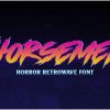
+2 +125+ of the Best '80s Fonts for Your Throwback Designs - Vandelay Design
Looking for the best 80s fonts? You'll love this collection of nostalgic typefaces that are perfect for your retro designs.
-
Interactive+4 +1
AutoDraw
Fast drawing for everyone. AutoDraw pairs machine learning with drawings from talented artists to help you draw stuff fast.
-
 +7 +1
+7 +1Random color generator - hex codes provided
Random Color Generator - generate colors along with their hex codes and CSS code. Two versions of each color are given, one with white text and the other with black text.
-
 +19 +1
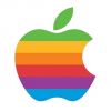
Is Apple About to Bring Back the Rainbow Logo?
According to MacRumors, they just might. A source of theirs at Apple has indicated that the company may be preparing to bring the old six-color rainbow logo, which was retired in 1999.
-
 +3 +1
+3 +1This hard-to-read font could be the ultimate study hack
A team of experts have developed a hard-to-read font specifically designed to help you remember things — aptly named Sans Forgetica.
-
 +1 +1
+1 +141 Landing Page Inspiration Examples To Escalate Better Conversion Rates
By seeking landing page inspiration you gather new tools and methods that can help visitors get further down the conversion tunnel. Discover this list of top landing page examples that will bring you new techniques and are sure to inspire your design. Try a new approach...
-
 +9 +2
+9 +2The Star Wars posters of Soviet Europe
Behind the Iron Curtain, artists created strikingly trippy ads for the saga, writes Christian Blauvelt.
-
 +12 +2
11 eye-popping web design trends you can expect to see in 2018
We’re approaching the end of 2017, which means I get to write my favorite article of the year: web design trends you can expect to see in the coming year. Below are the top 11 web design trends that I anticipate we will be seeing much more of in 2018.
-
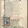 +16 +2
How Medieval Manuscript Makers Experimented with Graphic Design
'Designing English: Graphics on the Medieval Page' at Oxford's Bodleian Libraries considers how early English manuscripts approached graphic design.
-
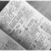 +11 +1
The pen is mightier than the laptop - learn how to use it!
Laptops have become lighter, thinner, and ubiquitous. With widely available tools such as Evernote, OneNote, Google Docs, etc. — note-taking has gone digital, and many people don’t see the value in old-fashioned analog. However, the value of note-taking lives in an intangible world. Longhand notes force selectivity, because writing does objectively take longer than typing.The extra processing of the material is extremely beneficial and forces content that really resonates. Being able to take a complex, sometimes very boring, conversation and distill it down into a one-page artifact is a skill in itself.
-
 +21 +3
This Insane Gremlins Poster Has 84 Different References On It—Can You Guess Them All?
When Randall picked up Gizmo from the antique store in Gremlins, obviously the Mogwai was the standout selection. That may not be the case, however, for this Gremlins poster, which turns that store into a pop culture cornucopia.
-
 +1 +1
+1 +1The Six Basic Elements of a Logo Design
A logo- the most important and fundamental part of building up a brand's identity, revolves around a set of rules. The rules provide a basic ground to establish the design for making it appropriate. Read more below
-
 +13 +4
Animation and Its Unparalleled, Productive Outcomes
Animation is the technique of creating two-dimensional drawings and inanimate objects, which are turned into rotating and moving visual representation. Read more in this article.
-
 +10 +2
SUPERFORMULA!
Super Formula Is Back! To get different shapes, change the numbers or move the sliders on the right by click and drag. (superformula.org)
-
Interactive+14 +3
Music-Map - The Tourist Map of Music
-
 +1 +1
+1 +1Six tips for a stand-out portfolio
As a creative professional, an easy, adaptable portfolio is essential.
-
 +21 +3
The rise of video game art.
One of the exciting art explorations which came out of the digital culture is video game art, an interesting form of interactive computer art based on video game designs.
-
 +20 +4
The playful yet sobering anti-alcohol posters of the Soviet Union
A new book from Fuel features previously unpublished anti-alcohol posters and graphic design from the 1960s to 80s in the Soviet Union.
Submit a link
Start a discussion