


-
 +28 +2
Google Trends - "Snapzu"
-
 +2 +2
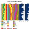
+2 +2Visualization of large datasets with tabplot
The tableplot is a powerful visualization method to explore and analyse large multivariate datasets. In this vignette, the implementation of tableplots in R is described, and illustrated with the diamonds dataset from the ggplot2 package.
-
 +2 +1
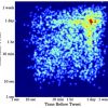
+2 +1Time Maps: Visualizing Discrete Events Across Many Timescales
Despite the simplicity of discrete event data, it’s hard to visualize many events over a long time period without hiding details about shorter timescales.
-
 +32 +1
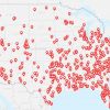
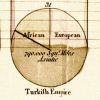
America's unique gun violence problem, in 17 maps and charts
America is an exceptional country when it comes to guns. It's one of the few countries in which the right to bear arms is constitutionally protected, and presidential candidates in other nations don't cook bacon with guns. But America's relationship with guns is unique in another crucial way: Among developed nations, the US is far and away the most violent — in large part due to the easy access many Americans have to firearms.
-
 +18 +1
OECD health statistics 2015. Compare your country.
Life expectancy, health risks, health expenditure
-
 +38 +1
Meet the Stanley Cup
The adventures of the greatest trophy in sports.
-
 +25 +1
These Lovely Maps Trace the Most Picturesque Routes of Every City in the World
Mapbox's Eric Fischer has been working on the "Geotaggers' World Atlas" for five years, using locations of photos uploaded on Flickr over a decade. In his city maps, which now span the world, he connects the dots between subsequent photos taken by a photographer—representing their path in sketchy lines that criss-cross across the city.
-
 +18 +1
The Scottish Scoundrel Who Changed How We See Data
When he wasn't blackmailing lords and being sued for libel, William Playfair invented the pie chart, the bar graph, and the line graph.
-
 +2 +1
+2 +1Snake Oil Supplements?
Do echinacea & Vitamin C kill colds? Will turmeric, goji berries or wheatgrass help you live to 150? See which health supplements are and aren't backed by science in this interactive chart.
-
 +6 +1
+6 +1The Surprising History of the Infographic
Early iterations saved soldiers' lives, debunked myths about slavery and helped Americans settle the frontier
-
 +11 +1
Micro-targeted digital porn is changing human sexuality
Ever-faster feedback loops and micro-targeted digital porn are pushing human sexuality into some seriously weird places
-
 +3 +1
+3 +1Artificial Intelligence Is Predicting Human Poverty From Space
“Our basic approach involved a machine learning technique called ‘transfer learning,’ which is the idea that you can solve a hard problem—in our case, predicting poverty from satellite images—by trying to solve an easier one. As you solve that, you can learn things that are transferable to help you solve the more difficult issue,” Jean added.
-
 +14 +1
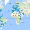
Wi-Fi passwords from airports around the world in one brilliant map
The map we never knew we needed.
-
How-to+1 +1
15 Useful Free Services To Create Online Data Backup
Taking a backup of the data that you are using for your work on the internet is one of the most important things that one must do.
-
 +6 +1
+6 +1OECD Health Statistics 2016.
OECD Health Statistics 2016 is the most comprehensive source of comparable statistics on health and health systems across OECD countries. All datasets have been updated in October 2016.
-
 +3 +1
+3 +1How to Solve Genomics' Big Data Management Problem
Big data scientists can store human genomes for easy access. But what challenges do they face when it comes to storage and privacy?
-
 +5 +1
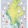
+5 +1CIA Releases Declassified Maps from 75 Years of Intelligence Cartography
To mark the 75th anniversary of its Cartography Center, the Central Intelligence Agency (CIA) shared decades of declassified maps.
-
 +32 +1
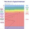
Your Life in Weeks
All the weeks in a human life shown on one chart. Sometimes life seems really short, and other times it seems impossibly long. But this chart helps to emphasize that it’s most certainly finite. Those are your weeks and they’re all you’ve got. Given that fact, the only appropriate word to describe your weeks is precious. There are trillions upon trillions of weeks in eternity, and those are your tiny handful. Going with the “precious” theme, let’s imagine that each of your weeks is a small gem, like a 2mm, .05 carat diamond.
-
 +5 +1
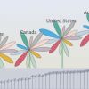
+5 +1OECD Better Life Index
This Index allows you to compare well-being across countries, based on 11 topics the OECD has identified as essential, in the areas of material living conditions and quality of life. Compare it with 361 other OECD regions.
-
 +5 +1
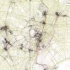
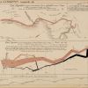
+5 +1The Underappreciated Man Behind the “Best Graphic Ever Produced”
Charles Joseph Minard’s name is synonymous with an outstanding 1869 graphic depicting the horrific loss of life that Napoleon’s army suffered in 1812 and 1813, during its invasion of Russia and subsequent retreat. The graphic (below), which is often referred to simply as “Napoleon’s March” or “the Minard graphic,” rose to its prominent position in the pantheon of data visualizations largely thanks to praise from one of the field’s modern giants, Edward Tufte.
Submit a link
Start a discussion