


12 years ago
6
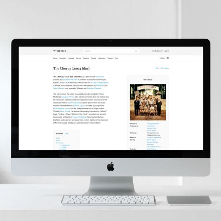
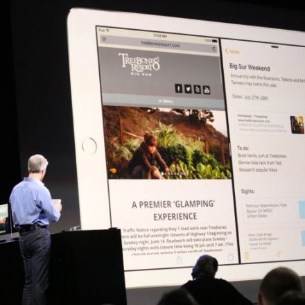
How Wikipedia would look in Modern Web-Design
While big parts of the internet have gone through an amazing journey in terms of typography these last years, Wikipedia’s reading experience is still stuck in the 90’s. We wanted to take a few days and propose a direction through which Wikipedia could move forward, focusing on articles and reading without necessarily having to change too much of what it is and should continue to be.
Continue Reading http://blog.weare1910.com


Join the Discussion
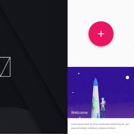
A long and learned treatise on what's wrong wiki Wikipedia's layout, replete with a half-dozen layout renderings explaining how it would look better and make more sense. Lovely renderings of both tablet and phone designs as well. Lovely stuff! Then, the kicker
So, write up a blog post on how to do it better, but don't contribute one line of code (or one penny in donations) to help make it that way.
So true. Everyone uses Wikipedia. Hardly anyone helps it out.
I don't see this as a critic to the current Wikipedia design, I see it as a comment on how typography and grid use could affect the aspect of a website, in this case Wikipedia. And it is true that the design isn't the best right now, the code for the website is developed by users, just like the articles and everything else, that explains why the website hasn't change much along the years.
Personally, I didn't think the layout was that great. Looked kind of empty if you ask me.
Yeah, I think wikipedia needs a design change..
I like it.