


9 years ago
Subway has a new logo for the first time in 15 years
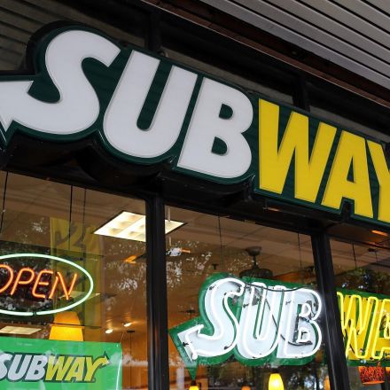
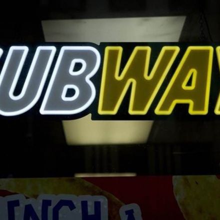
As Subway attempts to revamp its brand, the sandwich chain is debuting a new logo. On Friday, Subway unveiled the new design — the first time that the sandwich chain has significantly changed the major element of its identity since 2001. Subway. While the old logo utilized a bold, thick font, the new logo is more minimalist. The signature arrows on the "S" and "Y," however, will remain. The sandwich chain is also releasing a new symbol, which similarly utilizes the arrows. Subway calls the new logo the "next step" in the sandwich chain's evolution...
Continue Reading http://www.businessinsider.com


Join the Discussion