-
 +2 +1
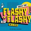
+2 +137 of the Best Fun and Playful Fonts - Vandelay Design
Here are the best fun and playful fonts that are perfect for giving your designs a whimsical and cheerful vibe. They're great for many different types of projects.
-
 +1 +1
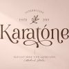
+1 +140 Elegant and Luxurious Fonts - Vandelay Design
Here are the best elegant and luxurious fonts that are perfect for chic and upscale designs. Use these typefaces for fashion designs, branding, editorial layouts, and more.
-
 +1 +1
+1 +140 of the Best Futuristic Fonts for Sci-Fi Designs - Bittbox
Typography is an essential element if you're creating a futuristic design. There is a quality about a modern typeface that makes it stand out in a crowd of designs. It's clean, sharp, and sleek. There's a creative presence that works well with large commercial designs and futuristic fonts. Using design elements that are geometric by […]
-
 +1 +1
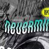
+1 +130 of the Best '90s Fonts and Typeface
Crop tops, overalls, denims, and yes…Tommy Hilfiger everywhere. We all remember the '90s and the trend is coming back to a degree! The '90s graphic design and typography is now different. It is bright, bold and grabs the audience's attention. It's meant to make a statement much like our fashion did. Retro designs are in […]
-
 +2 +1
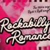
+2 +130+ of the Best 1950s Fonts for Typography and Lettering
Here are the best 1950s fonts to use in your vintage and retro designs. If you want a genuine '50s feel to your work, these fonts and typefaces won't disappoint.
-
 +2 +1
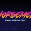
+2 +125+ of the Best '80s Fonts for Your Throwback Designs - Vandelay Design
Looking for the best 80s fonts? You'll love this collection of nostalgic typefaces that are perfect for your retro designs.
-
 +10 +1
The Mystery Font That Took Over New York
How did Choc, a quirky calligraphic typeface drawn by a French graphic designer in the 1950s, end up on storefronts everywhere?
-
 +3 +1
+3 +1This hard-to-read font could be the ultimate study hack
A team of experts have developed a hard-to-read font specifically designed to help you remember things — aptly named Sans Forgetica.
-
 +26 +1
How New Font Technologies Will Improve The Web
In this article, you'll learn about new font technologies, including the ins and outs of these new tools and how to take control of our typography.
-
 +20 +1
Not for the first time, Microsoft’s fonts have caught out forgers
If you’re going to pretend a document is from 2006, you should use Times New Roman.
-
 +21 +1
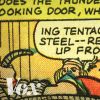
Where the "comic book font" came from
So...why does all the writing in comic books look like that? Vox's Phil Edwards looked into it and found an aesthetic shaped by comics culture, technology, and really cheap paper.
-
 +2 +1
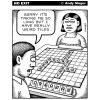
+2 +1Shapecatcher: Draw the Unicode character you want!
You need to find a specific Unicode character? With Shapecatcher.com you can search through a database of characters by simply drawing your character into a box. It can find the most similar character shapes for your drawing.
-
 +3 +1
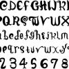
+3 +1Font puberty
When a font, as the size largens, becomes more smooth and less jagged looking. Usually occurs around size 14px, where you can really distinguish the smoothness of the letter.
-
 +18 +1
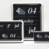
Video: Font Clock by Sebastian Wrong for Established & Sons
In this exclusive movie, London designer Sebastian Wrong reflects on living with the distinctive sound made by his 2007 Font Clock for Established & Sons.
-
 +6 +1
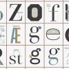
+6 +1A Handy Cheat Sheet For Understanding Typographical Anatomy
From the prolific poster-makers at Pop Chart Labs, here's "The Taxonomy of Typography."
-
 +37 +1
"My Little Pony" Sued For Using a Pirated Font
Typeface company Font Brothers has filed a lawsuit against Hasbro claiming that My Little Pony uses one of its fonts without permission. According to the complaint, Harbro refuses to pay the required licenses while it continues to use the font in its My Little Pony merchandise and products.
-
 +5 +1
+5 +1Sexism & Fonts
My five-year-old son asked me this question the day Positype released its promotional site for Lust Hedonist. The Lust Series, a self-described “overly indulgent attempt to infuse wanton sensuality in a typeface,” features a variety of formal contrasts: sharp and curvy serifs, thin counters combined with thick bodies. It is the work of Neil Summerour, known for his crowd-pleasing fonts and lettering, and it is striking.
-
 +1 +1
+1 +110 Iconic Fonts and Why You Should Never Use Them
We've got a lot to thank Bill Gates, Steve Jobs and the computing world's other leaders for. They're responsible for some of the greatest leaps forward in co
-
Download+1 +1
100 best Typefaces of all times
-
 +2 +1
+2 +110 Professional-Looking and High Quality Fonts for Web Designers
The importance of fonts to designers has always been emphasized. Many design blogs also agree that, as designers, choosing high quality fonts should be like choosing your clothes. People will think of you differently if you sport the wrong one. That is why we collected ten beautiful fonts for you that you will never hesitate ... Continue Reading
Submit a link
Start a discussion
