


10 years ago
2
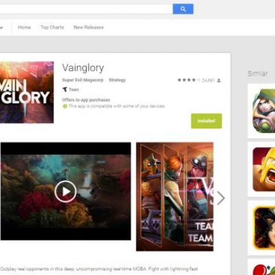
The New Play Store Web Interface Appears To Be Rolling Out To Everyone
I can't quite say I'm a fan of this redesign. It dosent really seem to adhere to material design guidelines. Lots of wasted and empty space it seems. I probably would not get used to it since I check the playstore 97% of the time on my phone.
Continue Reading http://www.androidpolice.com


Join the Discussion
I already had the new design before, the empty space is useful if you have big monitor because it keeps the important things close to the center. But as you said it's not that important as the play store is mostly used from the android app.
I'm not sure I'm fond of Material Design overall, really. I've seen some very stylish implementations, but Google themselves seem to be inconsistent in how they style their apps, and some of the Material Design implementations I've seen seem excessively wasteful of whitespace anyway.