


10 years ago
1
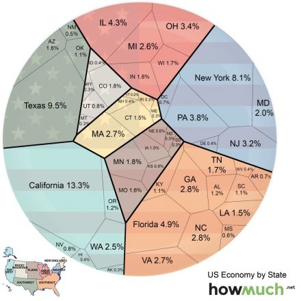
Here’s How Much Each State Contributes to US Economy
The United States had a $17.3 trillion economy in 2014 — that’s about $7 trillion ahead of China — which makes it the wealthiest nation in the world by far. Where’s all that wealth coming from?
Continue Reading http://blogs.voanews.com


Join the Discussion
Kind of a crappy diagram. It's incredibly difficult to figure out who's contributing the most to the economy by shoving it all in a circle that's not even divided in to slices.
It would've been better to see an economic impact per capita chart. I get that Texas and California are our biggest contributors but they also have a massive population. The smaller states look like crap in comparison even though they could provide a more efficient and lucrative industry to the US.