


10 years ago
7
Designer Creates Beautiful Logo For 2020 Tokyo Olympics And The Internet Is Loving It
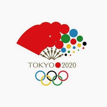
Spain-based Japanese graphic designer KanKan has created a brilliant logo concept for the 2020 Tokyo Olympics, that’s winning the internet. Check it out below. KanKan shared the design on his Twitter account, explaining how the fan symbolises good luck and has been a part of Japanese culture since ancient times. The red dots symbolise the sun (Japanese flag) and the various colors denote harmony.
Continue Reading http://digitalsynopsis.com


Join the Discussion
The transition from solid to dots is a little weird, but it is several leagues above the official logo.
First thing I noticed also
I kind of feel bad for the designer who made the official logo, but it really is hideous.
This illustrates why I personally feel that the Olympics, as a celebration of global unity, are the perfect example of what would benefit greatly from crowd-sourcing. If we could get rid of the IOC, which has a history of exploitation, and instead crowd-sourced the entire operation, it would be a beautiful gesture of a new paradigm, and the proceeds could be better utilized for global causes.
No more locked access to broadcast networks, no more DMCA claims against protesters - take back this symbol of the people. Like this logo, it would be better, more representative snapshot of the collective global moment.
But the probability of that is nil.
Damn, that's much nicer than the official one (which I always thought looks like it's the logo for some boring utility company or something.
I'll say what I said on Reddit yesterday; I actually do prefer the official logo to the one this "designer" has created.
One commentor shared this link, which also includes this video. Seeing the design in action, I can really get behind the overall branding.
It's not great, but you can see the T, and the typeface was obviously chosen to correspond with the shape of the logo. The designer's own explanation for the black bar is that "black represents diversity because it includes all the colours," which I think it pretty dumb, but the shape itself is strong and bold, complimenting the thin points of the gold and silver shapes well. The gold and silver immediately call to mind medals – victory – and the gold, furthermore, is the same as (or very similar to) the colour used in the Togo 1964 logo. And then there's the red circle – an obvious reference to Japan's flag, but also the only bold colour in the logo (aside from the rings, of course), which makes it a major focal point, and keeps the logo overall looking clean and elegant.
Is it perfect? I'd say no, but it's a sight better than Olympic logos of recent years. To me, what really makes it a great bit of design is the theme that can be made from all the shapes involved.
What do you think about the similarity between the official logo and the logo for the Theatre de Liege, seen at the top left of their website?
I definitely see it, and I'm aware of the issues that have arisen (copyright/plagiarism claims) over the similarities between the logos. I think this sort of thing does tend to get a little overhyped as people cling to any criticism – I'm not convinced the designer for the Tokyo2020 logo would have had any reason to see the Théatre de Liège's logo to copy it, you know? But do correct me if I'm wrong on that one. The similarity exists, of course, but it's hardly intentionally deceptive or anything.
That said, though, I have to appreciate how very suitable the theatre's logo is, with the easily identifiable T and L. The L-like shape is still kind of problematic for me wrt the Tokyo2020 logo; the only way I can really justify it is to think of the logo as abstract, like London2012's (which only vaguely resembled "2012"). However, while it's far from perfect – surely an Olympic amount of money could've gone back to the drawing board? – it's also not as bad as people like to say.