


7 years ago
1
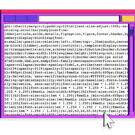
The Bullshit Web
My home computer in 1998 had a 56K modem connected to our telephone line; we were allowed a maximum of thirty minutes of computer usage a day, because my parents — quite reasonably — did not want to have their telephone shut off for an evening at a time. I remember webpages loading slowly: ten to twenty seconds for a basic news article.
Continue Reading https://pxlnv.com


Join the Discussion
In my twenties and early thirties I have been designing websites for companies. My main rule was to keep the landing page at 32 kB. I called that lovingly "Hoevenaar's 32 'kay Law" and it has been working like that for many years. All I wanted is that people from -all over the world- can see and interact with the designs.
With the dawn of every new way to make webpages more attractive, a sleuth of designers cram every design full of it, to be sure that people see their "savviness". All nice and such, but by designing that way you miss a very important wish that pretty much every client has: fast loading times and a clear guidance to browse through the site. A difficulty that always exists is innovation and progress: browsers develop independently, W3C standards and rules get ignored because of wanting to be flashy (pun intended), a big diversity of computers to develop for (mobile, pc, tablet) and that's all just the tip of the iceberg. Just the scripting for making it work on all devices is a big hell-hole, not even mentioned the test-phase of them. Those scripts do not need to be that big, I guess, but to please everybody you need a lot.
Webdesigners and developers should stay clear and disciplined considering loading times, scripts, usability and the implementation of media. Now let's all never ever say to a client that "pretty much everything's possible nowadays" and just sprinkle the media with constraint over the pages.
This is a summary of why I chose painting over digital designing.