
10 years ago
2
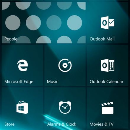
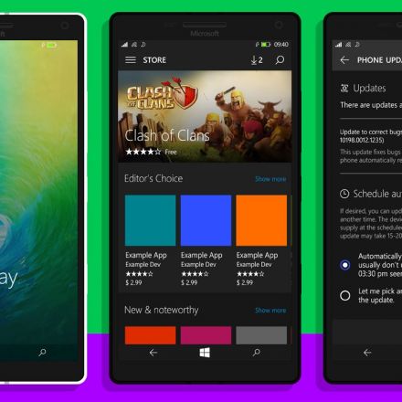
Windows 10 Mobile Build 10162 screenshots leak ahead of possible release!
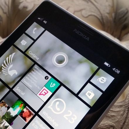
It's been a few weeks since the last Windows 10 Mobile (Build 10149) was released to the fast ring. Build 10149 finally delivered a reliable enough build for most mobile Insiders with major features.
Continue Reading













Join the Discussion
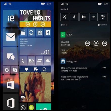
I'm liking everything except the launcher. Never been a fan of the semi-transparent blurred background found on apps like Muzei wallpaper for Android (which can be unblurred thankfully). The colors and general theme as seen in the settings is really nice on the eyes, and I actually use the same on my phone with BlissPop ROM and Deep Darkness theme, giving that generally dark feel with that greenish text color. Looking forward to see what hardware this runs on as well.
I'm not entirely sure, but I think that the 'aero' looking theme will be optional on W10M. You may be able to switch it back to a regular wallpaper and transparent/solid tiles. I don't think that's gone away I just think it leaks more often this way because it appeals to a wide range of people. Personally I like the look of the WP8.1 Start but we'll have to wait and see what happens.
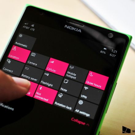
Edit: oh and by the way, it will definitely be running on THIS! :)