


10 years ago
10
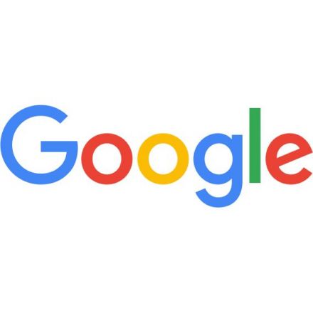
Google has a new logo
Google has changed a lot over the past 17 years—from the range of our products to the evolution of their look and feel. And today we’re changing things up once again.
Continue Reading http://googleblog.blogspot.ca
-
Google’s look, evolved
Additional Contributions:


Join the Discussion
I like it. It's cleaner, and it conveys that sense of Google as a benevolent force that helps you get stuff done. It's almost childish yet elegant at the same time.
Definitely childish, not a bad thing but their "Alphabet" push has definitely made everything more childlike. Not overly sure why they've gone that route to be honest.
Especially with those colors.
Get them While they're young?
That attitude has served the Catholic church well though they never tried to be child friendly at the same time.
Must say it works, My kids are all about "can you ask google [_________]?" though I must admit Cortana is taking over there now, but only because she sings and tells jokes they dont understand i think.
The new logo is easier to see at small sizes, especially the yellow "O", which sort of faded into the white backdrop before.
I still miss that crazy lowercase "g", though.
The really thin "O" was iconic for me as well, don't really know why.
Oh yeah, the old one had a lot more character.
It's the same but a different font. Probably took them 5 minutes to do. This is like saying "Company paints front door a slightly different colour".
Slow news day?
The pre-2000's logos were just horrible.
The year 2000 is when they started paid adverts.