


10 years ago
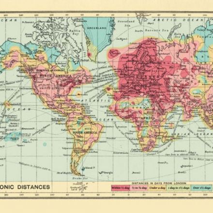
Heat map shows how the world has shrunk for travellers: 1914 v 2016
A 2016 version of a 1914 heat map showing travel times to distant countries illustrates how travel times have changed in 100 years
Continue Reading http://www.telegraph.co.uk


Join the Discussion