


-
Interactive+18 +1
MapFight - compare country size
Overlay map of any country or US state with map of any other
-
 +23 +1
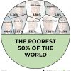
Visualising a Disturbing Truth
8 Billionaires Own as Much as 3.6 Billion People
-
 +12 +1
The best stats you've ever seen
You've never seen data presented like this. With the drama and urgency of a sportscaster, statistics guru Hans Rosling debunks myths about the so-called "developing world."
-
 +12 +1
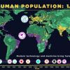
How we became more than 7 billion – humanity’s population explosion, visualised | Aeon Videos
From our origins in Africa, humans began migrating around the globe roughly 100,000 years ago. But it was only with the advent of agriculture about 12,000 years ago that our population started to swell to more than a million. This data visualisation from the American Museum of Natural History beautifully charts humanity’s stunning – and increasingly alarming – exponential expansion to our current population of roughly 7.4 billion.
-
Current Event-1 +1
Live Hadoop Training Classes by Hadoop Experts
Enroll for Expert level Instructor Led Online Hadoop training ✔30 Hrs ✔Project Scenarios ✔Recorded Sessions ✔Training Material ✔Pay in Instalments*
-
 +16 +1
Six maps that show the anatomy of America’s vast infrastructure
A look at the United States’s bridges, electrical grid, pipelines, railroads, airports and waterways. By Tim Meko.
-
 +17 +1
The Official Thomas Friedman ‘Make a Meaningless Graph’ Contest
‘New York Times’ Thomas Friedman graphed history in his new book, ‘Thank You For Being Late’ – outdo him and win a free T-shirt! By Matt Taibbi.
-
 +17 +1
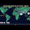
Human Population Through Time
It took 200,000 years for our human population to reach 1 billion—and only 200 years to reach 7 billion. But growth has begun slowing, as women have fewer babies on average. When will our global population peak? And how can we minimize our impact on Earth’s resources, even as we approach 11 billion?
2 comments by rti9 -
 +13 +1
Weather Forecast Maps
Animated wind, rain and temperature maps, detailed forecast for your place, data from the best weather forecast models such as GFS, ICON, GEM
-
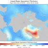 +2 +1
+2 +1Check how Greenland is losing its water mass (ice) according to NASA's GRACE mission (GIF)
Animated was created in NASA's Panoply app.
-
 +24 +1
The Ecological Wealth of Nations
Ecological assets are at the core of every nation's long-term wealth. Yet today, population growth and consumption patterns are putting more pressure on our planet's ecosystems...
-
 +1 +1
+1 +1The visualizations transforming biology
Inventive graphic design and abstract models are helping researchers to make sense of a glut of data. By Ewen Callaway. (July 4, 2016)
-
 +12 +1
This Is What Musical Notes Actually Look Like
“To investigate these patterns, he rigged up a contraption involving a frequency generator on his laptop, a rebuilt amp with a speaker pointing upward into a plastic vitrine filled with ink-black water, and a guitar tuner…” By Heather Sparks.
-
 +12 +1
W. E. B. Du Bois’s Modernist Data Visualizations of Black Life
Du Bois’s charts focus on Georgia, tracing the routes of the slave trade to the Southern state, the value of black-owned property between 1875 and 1889, comparing occupations practiced by blacks and whites, and calculating the number of black students in different school courses (2 in business, 2,252 in industrial). By Allison Meier.
-
 +2 +1
+2 +1Snake Oil Supplements?
Do echinacea & Vitamin C kill colds? Will turmeric, goji berries or wheatgrass help you live to 150? See which health supplements are and aren't backed by science in this interactive chart.
-
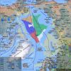 +34 +1
Six maps that will make you rethink the world
The typical world map that hangs on the walls of classrooms is essentially obsolete, says the author of a new book.
-
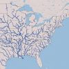 +4 +1
+4 +1Interactive Map of U.S. River Systems
Made with data available from the U.S. Geological Service and the EPA.
-
 +20 +1
The History of Barcelona, in 26 Interactive Maps
Watch the city evolve from 150 A.D. to 2010.
-
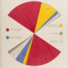
 +18 +1
The Scottish Scoundrel Who Changed How We See Data
When he wasn't blackmailing lords and being sued for libel, William Playfair invented the pie chart, the bar graph, and the line graph.
-
 +18 +1
Why the World Is Better Than You Think in 10 Powerful Charts
When I published Abundance: The Future is Better Than You Think in February 2012, I included about 80 charts in the back of the book showing very strong evidence that the world is getting better. Over the last five years, this trend has continued and accelerated. This blog includes additional "Evidence for Abundance" that you can share with friends and family to change their mindset. We truly are living in the most exciting time to be alive.
Submit a link
Start a discussion