


-
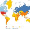
 +19 +3
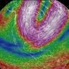
A Hypnotic Visualization Of The Polar Vortex From Space
Here on terrestrial Earth, the polar vortex is making all of our lives miserable, from frostbite-inducing chills in the North, to snow and ice blanketing Florida, to drivers in Atlanta getting stuck in traffic for 22 hours and comparing the scene to a zombie movie. As visualized from space, though, the polar vortex is a beautiful, panchromatic cyclone of endlessly flowing eddies and currents. It's mesmerizing.
-
 +13 +4
How Legos Licensed the Universe, and Ended Up Ruling Us All
Lego today: Crushing the toy industry under its interlocking feet, having overtaken Mattel and Hasbro as the most profitable toymaker in the world. That's partially due to licensing deals, which, starting in 1999, added icons like Darth Vader and Batman to the mix.
-
 +8 +2
+8 +2The Astonishing Growth of American Gun Culture, In Three Graphs
Americans like guns. A look at public data shows how much: Gun production is up, gun background checks are up — and even gun-related baby names are on the rise.
-
 +18 +5
Nine charts that tell you where life is pretty terrific and where people are miserable
The Paris-based think tank known as the OECD is just out with its semi-annual survey of how different economies stack up in terms of social well-being. (Well-being is basically the polite way economists talk about happiness.) The organization even has a new data visualization to let you see where your country ranks in certain key measures...
-
 +18 +5
One Gif Map Shows The History of The Death Penalty in The United States
Watch the death penalty evolve from 1887 until present day.
-
 +16 +3
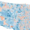
Here's Where More People Are Dying Than Being Born
A map showing US Census estimates of deaths and births in counties.
-
 +24 +3
How Americans Die
Americans die in smaller portions each year, but what kills us is changing.
-
 +14 +4
Maps of the Internet
Information Geographies at the Oxford Internet Institute turned data about the internet into beautiful images.
-
 +36 +6
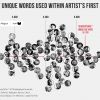
The Largest Vocabulary in Hip hop
Literary elites love to rep Shakespeare’s vocabulary: across his entire corpus, he uses 28,829 words, suggesting he knew over 100,000 words and arguably had the largest vocabulary, ever. I decided to compare this data point against the most famous artists in hip hop. I used each artist’s first 35,000 lyrics. That way, prolific artists, such as Jay-Z, could be compared to newer artists, such as Drake.
-
 +17 +4
Overworked America: 12 Charts That Will Make Your Blood Boil
Why "efficiency" and "productivity" really mean more profits for corporations and less sanity for you.
-
 +27 +6
Interactive: Global peace index per country
A ground-breaking milestone in the study of peace. For the first time, an Index has been created that ranks the nations of the world by their peacefulness and identifies some of the drivers of that peace.
-
 +15 +3
A Map of Maternity Leave Policies Around the World
The U.S. is one of only a handful of countries that does not require some form of paid time off for new mothers.
-
 +37 +4
Lightning map shows all lighting in real-time on a map
Storm map with live lightning strikes for the USA and Canada, based on data from the lightning detection network Blitzortung.org.
-
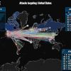 +19 +3
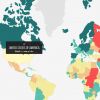
This Site Shows Who Is Hacking Whom Right Now — And The US Is Getting Hammered
The U.S. was far and away the most popular hacking target in the world.
-
 +3 +1
+3 +1Four Maps that Explain Islam in Africa
As President Obama argued in his recent West Point foreign-policy speech, extremist groups such as Boko Haram and al Shabab constitute a significant threat to both regional and international security. However, while groups like Boko Haram and al Shabab. These four maps, ‘Percentage of Muslims Per Country,’ ‘Number of Muslims Per Country,’ ‘Presence of Sharia Law,’ and ‘Traditions of Islamic Jurisprudence’ give a compelling account of where African Muslims live and how they understand the world.
-
 +19 +4
17 Maps That Will Change How You See the World
Or at least answer burning global questions, such as "Which country has the hairiest men?"
-
 +22 +4
Eight reasons why New Yorkers should stop complaining about how hard life is in New York
If you have ever been to NY, read anything about it, or listened to Frank Sinatra, you know the two most important things about the Big Apple are that it’s the best city on earth and an incredibly tough place to live. Busy, expensive, dirty, too hot or too cold, NY is a giant rat race—and full of actual rats—with a challenging scarcity of real estate, eligible bachelors, and large sodas (no, just kidding, the soda ban was banned).
-
 +7 +2
+7 +2New heat map reveals America's hot and cold spots for broadband
A new map of broadband speeds shows which Americans enjoy the fastest and slowest internet connections.
-
 +28 +3
30 Years Of Music Industry Change In One GIF
Everybody knows the music industry has undergone monumental change in the past 30 years. How much change? This handy GIF from Digital Music News, which breaks down revenue according to medium (adjusted for inflation) will show you.
-
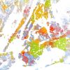 +20 +6
The Best Map Ever Made of America’s Racial Segregation
Last year, a pair of researchers from Duke University published a report with a bold title: “The End of the Segregated Century.” U.S. cities, the authors concluded, were less segregated in 2012 than they had been at any point since 1910. But less segregated does not necessarily mean integrated–something this incredible map makes clear in vivd color.
Submit a link
Start a discussion