


-
 +29 +3
World Cup: Team-by-team analysis
We examine the strengths, weaknesses and prospects of every team.
-
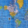
 +15 +3
11 Overlay Maps That Will Change The Way You See The World
Nothing is what it seems.
-
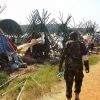 +14 +1
What Is Going on In South Sudan?
The situation in South Sudan explained in simple point form and easy to understand format.
-
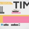 +33 +7
The History and Future of Everything -- Time
How much time do you have left?Time makes sense in small pieces. But when you look at huge stretches of time, it's almost impossible to wrap your head around things. So we teamed up with the awesome blog "Wait but Why" and made this video to help you putting things in perspective with some infographics!
-
 -1 0
-1 0Художница и коллекционер. Gladys Roldan De Moras
Блог о живописи, современных художниках и фотографах.
-
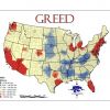 +20 +5
Maps of Seven Deadly Sins in America
Geographers from Kansas State University have created a map of the spatial distribution of the Seven Deadly Sins across the United States. How? By mapping demographic data related to each of the Sins.
-
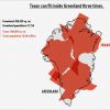
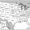 +15 +4
U.S. States Renamed For Countries With Similar GDPs
The creator of this map has had the interesting idea to break down that gigantic US GDP into the GDPs of individual states, and compare those to other countries’ GDP.
-
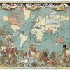 +17 +2
Map of the British Empire in 1886
This map is just before the Scramble for Africa where within 15 years, most of the continent had also been divided up between European powers, with the British Empire getting a very large share.
-
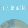 +2 +1
+2 +1Why is the Sky Blue? | Halftone
It's a simple question that few can answer correctly. A wonderful Interactive infographic about how the sky is blue. By Halftone
-
 +18 +2
The anatomy of an Android update (Infographic)
Ever wonder why it takes so damn long to release an android update? Here is why..
-
 +17 +3
Infographics Lie. Here's How To Spot The B.S.
Infographics are all over the place nowadays. How do you know which ones to trust? Follow these three easy steps to save yourself from getting duped.
-
 +22 +3
40 maps that will help you make sense of the world
If you’re a visual learner like myself, then you know maps, charts and info graphics can really help bring data and information to life. Maps can make a point resonate with readers and this collection aims to do just that. Hopefully some of these maps will surprise you and you’ll learn something new. A few are important to know, some interpret and display data in a beautiful or creative way, and a few may even make you chuckle or shake your head.
-
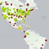
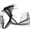 +20 +5
Painted Ships on Painted Oceans: an Accidental Map of the Doldrums
Take millions of data points, each one a geolocated entry plucked from a digitised collection of 18th- and 19th-century ships’ logs, pin them all on a blank canvas, and you get this extraordinary world map.
-
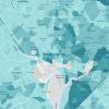 +20 +1
Mapping Poverty in America
Data from the Census Bureau show where the poor live.
-
 +21 +2
40 more maps that explain the world
Maps can be a remarkably powerful tool for understanding the world and how it works, but they show only what you ask them to. You might consider this, then, a collection of maps meant to inspire your inner map nerd. I've searched far and wide for maps that can reveal and surprise and inform in ways that the daily headlines might not, with a careful eye for sourcing and detail. I've included a link for more information on just about every one. Enjoy.
-
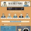 +17 +3
Habits of the World's Wealthiest People (Infographic)
A look at some of the traits and routines shared by the world's richest people.
-
 +21 +6
The History of Popular Music, According to Google
Google unveiled a new way to look at the history of music today, Music Timeline. Drawing on the songs that reside in the collections of millions of Google Play users, the company created a visualization of the popularity of various artists and genres from 1950 to today.
-
 +15 +4
How Vaccine Fears Fueled The Resurgence Of Preventable Diseases
An interactive map shows how measles and whooping cough have made a comeback in the U.S. and Europe.
-
 +16 +5
How the World Gets Drunk
How do people like to get drunk around the world? Using alcohol of course!
-
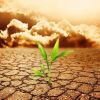 +15 +4
12 Graphics that Contain Everything You Need to Know about Climate Change
Climate change is real, it’s here and it will be affecting the planet for a long, long time. That’s the lesson of the latest iteration of the Intergovernmental Panel on Climate Change‘s state of climate science report, released in its entirety on January 30.
Submit a link
Start a discussion